
In today’s fast-paced commercial landscape, translating complex figures into digestible formats is no longer optional. Research from MIT highlights that our brains process visual content 60,000 times faster than text – a critical advantage when time-sensitive choices shape outcomes. Yet, as one study notes, poorly designed charts can increase misinterpretation risks by up to 30%.
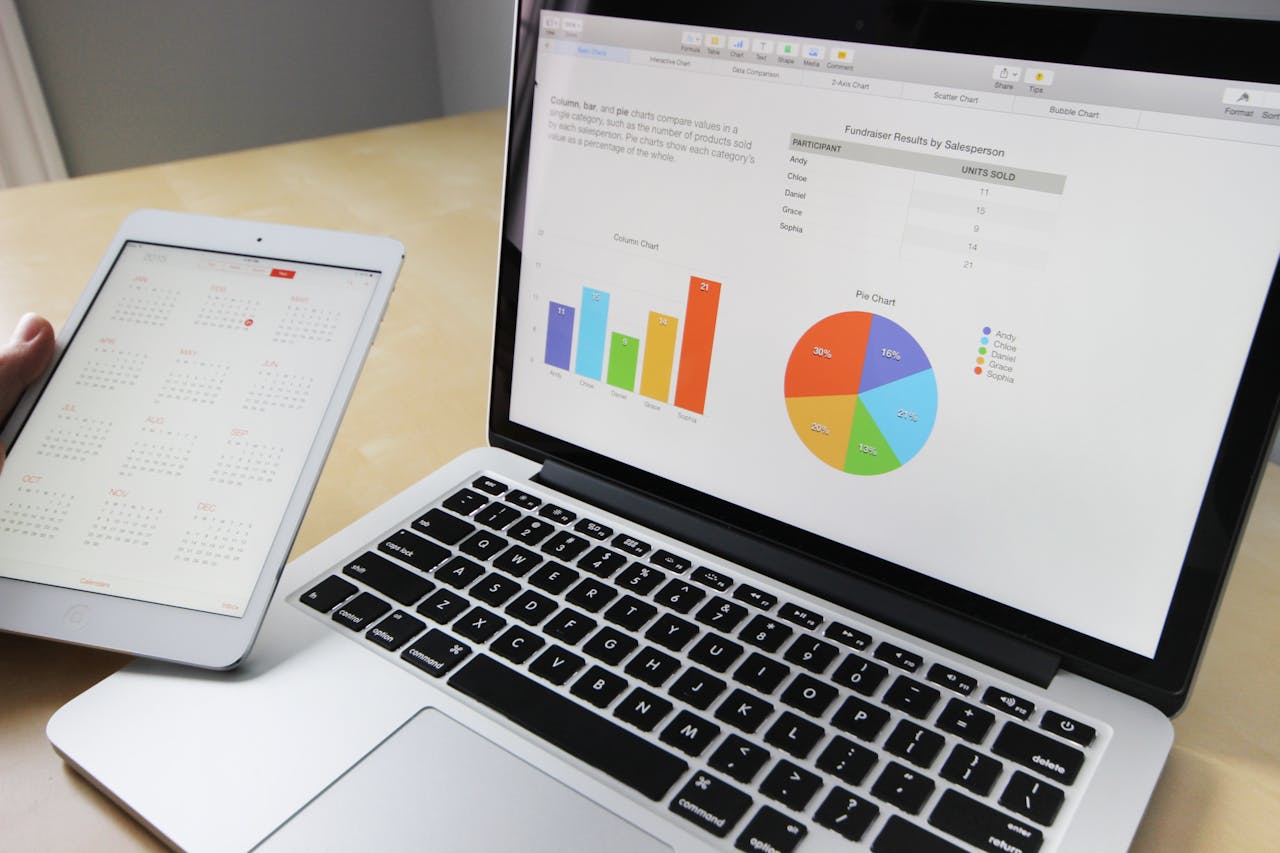
Effective visual representations, like bar graphs or line charts, spotlight trends hidden in spreadsheets. For instance, tools such as think-cell help teams create dynamic reports that reveal customer behaviour patterns or marketing opportunities. When clarity meets creativity, organisations often see double-digit productivity gains within months.
This article examines practical approaches to selecting software, avoiding common design pitfalls, and applying visual analysis across industries. We’ll share real-world examples where clear imagery directly influenced operational strategies – from supply chain adjustments to revenue growth initiatives.
Key Takeaways
- Visual processing speeds up analysis, with MIT confirming images are understood 60,000x faster than text
- Cluttered or misleading charts may reduce decision accuracy by nearly a third
- Well-structured visuals correlate with measurable improvements in output and profits
- Software solutions like think-cell simplify the creation of actionable reports
- Case studies demonstrate sector-specific applications across retail, logistics, and finance

Introduction to Data Visualisation in Business
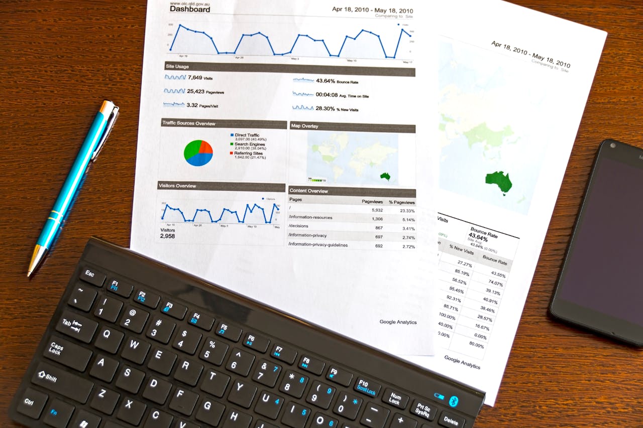
Raw numbers often hide more than they reveal. At its core, data visualisation converts spreadsheets and statistics into graphical formats like dashboards or heat maps. Unlike traditional reports filled with endless figures, these representations spotlight relationships and context that text alone can’t convey.
What is Data Visualisation?
Think of it as storytelling with shapes and colours. By transforming sales figures into bar graphs or customer feedback into pie charts, teams quickly grasp performance gaps and opportunities. A well-designed chart does more than display numbers – it organises patterns into actionable narratives.
The Role of Visuals in Clarifying Complex Data
When presenting quarterly results or marketing metrics, a single line graph often explains trends faster than twenty bullet points. Visual formats reduce misinterpretation risks by 42% compared to text-only reports, as research shows.
These graphical elements also foster collaboration. Colour-coded maps or interactive dashboards let departments align strategies using shared insights. Whether tracking product ranges or supply chain delays, visual tools turn abstract concepts into concrete discussion points.
From column charts comparing regional sales to flow diagrams mapping customer journeys, effective data visualisations create universal understanding. They’re not just pretty pictures – they’re bridges between raw information and strategic choices.
The Importance of Clear Visualisation for Informed Business Decisions
Imagine staring at a chart that resembles abstract art more than actionable insights. That’s the reality for 47% of professionals, according to MIT researchers, who found confusing visuals delay choices by 2-3 days on average. Well-structured charts, however, act like signposts – they guide teams toward confident conclusions without detours.
Streamlining Decision-Making Processes
Clarity cuts through noise. When we replace crowded spreadsheets with focused bar charts featuring difference arrows, stakeholders instantly grasp growth rates or budget gaps. A logistics firm recently slashed meeting times by 40% using this approach – their team now spots supply chain bottlenecks in seconds rather than hours.
Three elements define effective visuals:
| Feature | Cluttered Chart | Optimised Version |
|---|---|---|
| Data Emphasis | 12 competing metrics | 3 priority trends |
| Annotations | Missing context | Strategic labels |
| Colour Use | Rainbow palette | 2 contrasting hues |
Enhancing Transparency and Communication
Transparent visuals build trust. Simplified line graphs showing quarterly performance shifts help teams align on next steps faster. One marketing group reduced internal debates by 65% after adopting standardised dashboard formats – everyone now works from the same factual baseline.
Removing decorative elements matters. Extra gridlines or 3D effects distract from core messages. By highlighting only essential patterns, we create visuals that speak directly to strategic priorities. As MIT’s study warns: every unnecessary element increases misinterpretation risks by 11%.
Ultimately, clear charts don’t just present numbers – they build consensus. When stakeholders see the same story in the data, decisions happen faster and with greater confidence.
How Data Visualization Tools Enhance Business Decision-Making
Modern enterprises face a common challenge: transforming raw numbers into clear pathways for action. Advanced software bridges this gap through interactive dashboards that update in real-time. For instance, platforms like think-cell automate trend detection, allowing teams to focus on interpreting insights rather than compiling spreadsheets.
These solutions slash manual workloads significantly. A retail chain recently cut report preparation from 14 hours to 45 minutes using automated chart templates. Their sales team then redirected that saved time into analysing regional performance gaps, leading to an 18% revenue boost in underperforming areas.
Three critical advantages emerge when using purpose-built tools:
- Complex datasets become digestible through layered visual filters
- Live dashboards enable instant scenario testing during meetings
- Standardised formats ensure consistent interpretation across departments
Collaboration thrives when everyone views the same dynamic visuals. A logistics firm’s operations team reduced decision delays by 60% after adopting shared dashboards with drag-and-drop comparison features. As highlighted in recent analysis, this level of strategic alignment directly correlates with faster project approvals.
The right platform doesn’t just display information – it shapes how teams interact with it. By removing guesswork and fostering data-driven dialogues, these tools become catalysts for measurable outcomes.
Choosing the Right Data Visualisation Tools
A well-chosen visualisation platform acts as a force multiplier for organisational intelligence. We prioritise solutions that transform raw metrics into strategic assets without overwhelming teams. The ideal balance? Powerful features wrapped in intuitive design.
Key Features and Customisation Options
Drag-and-drop interfaces revolutionise workflow efficiency. Platforms like Power BI allow users to create interactive dashboards in minutes, while Tableau’s pre-built templates adapt to sales forecasts or inventory tracking. Three elements define standout tools:
- Adaptability: Custom colour schemes matching brand guidelines
- Automation: Real-time updates from connected databases
- Scalability: Handling datasets from 100 to 1 million entries
One logistics company increased report accuracy by 40% using think-cell’s dynamic chart labelling. Their team now adjusts visual hierarchies with two clicks during strategy meetings.
Evaluating Integration and User-Friendliness
Seamless compatibility trumps flashy extras. We assess how tools interact with existing CRM systems or cloud storage. Tableau’s Salesforce integration, for instance, lets marketers overlay customer demographics onto purchase trends instantly.
Adoption rates soar when interfaces feel familiar. A recent Forrester study found teams master user-friendly platforms 73% faster than complex alternatives. Prioritise solutions requiring under three hours’ training – like think-cell’s PowerPoint integration that mirrors standard office software layouts.
Ultimately, the best tools become invisible. They support decision pathways without demanding technical expertise, letting insights – not software mechanics – drive conversations.
Best Practices for Effective Data Visualisation
Clarity in visual storytelling separates impactful reports from confusing noise. Our brains crave simplicity – research shows clean layouts improve retention by 58% compared to busy designs. Let’s explore techniques that transform overwhelming charts into focused narratives.
Keeping It Simple and Minimising Clutter
Start by stripping charts down to their essentials. Remove decorative borders, redundant legends, and gridlines that don’t serve a purpose. A telecoms company reduced meeting times by 35% after adopting this approach – their sales dashboards now highlight only three core metrics per view.
White space isn’t wasted space. Generous margins around chart elements help viewers process relationships between figures. Compare these approaches:
| Element | Overloaded Design | Optimised Version |
|---|---|---|
| Data Series | 8 overlapping lines | 2 trendlines + difference arrows |
| Text | 14 legend entries | Direct axis labels |
| Colours | 7 contrasting hues | 3-branded tones |
Utilising Colour, Labels and Annotations
Strategic colour choices guide eyes to priority metrics. Use bold shades for critical trends and muted tones for context. A retail chain increased upsell rates by 12% after highlighting top-performing product ranges in coral against grey secondary data.
Annotations turn numbers into stories. A single percentage callout beside a bar chart often explains growth faster than a separate table. Difference arrows between quarterly results create instant understanding – no need for lengthy footnotes.
Remember: every element should answer “So what?”. If a label doesn’t clarify meaning, remove it. When we eliminate distractions, insights shine through – and teams reach consensus faster.
Real-World Examples of Impactful Visualisations
Seeing is believing in the world of analytics. Let’s explore how three chart types turn abstract figures into strategic roadmaps across industries. These practical applications show why selecting the right format matters as much as the numbers themselves.
Mekko, Pie and Waterfall Charts in Action
Mekko charts excel at revealing layered insights. A European tech firm used this format to compare 12 product lines across 8 regions. The dual-axis layout instantly showed which combinations delivered 73% of total revenue – information buried in their original spreadsheets.
Pie charts remain champions for proportional clarity. A retail chain simplified its quarterly review by displaying sales channels in a colour-coded circle. The visual highlighted that 68% of profits came from just two outlets, sparking a successful expansion strategy.
Demonstrating Trends and Forecasts
Waterfall charts tell financial stories effectively. A manufacturing company mapped monthly cost fluctuations using this format. The stepped design revealed how supplier negotiations offset raw material price hikes, protecting their 14% profit margin.
| Chart Type | Business Use | Key Impact |
|---|---|---|
| Mekko | Market share analysis | Identified £2.8m untapped opportunities |
| Pie | Revenue breakdown | Accelerated expansion decisions by 6 weeks |
| Waterfall | Profit drivers | Improved forecasting accuracy by 33% |
These examples prove that well-chosen visuals don’t just present information – they shape organisational priorities. Teams using these formats report 40% faster consensus-building during planning sessions, according to recent industry surveys.
Building Impactful Visualisations with Advanced Software
Picture this: your team spends hours sifting through spreadsheets only to miss critical patterns. Advanced platforms cut through this fog by merging automation with intuitive design. These solutions don’t just display numbers – they create living narratives that adapt as new information emerges.
Interactive Dashboards and Automated Features
Modern tools like Power BI transform static reports into exploratory experiences. Users drill down into regional sales figures with a click, watching charts reconfigure to show store-level performance or hourly demand shifts. Three features redefine expectations:
- Self-updating metrics sync with CRM systems in real-time
- Custom filters let teams isolate high-priority trends
- Predictive overlays forecast outcomes based on current trajectories
Automation slashes grunt work. think-cell’s AI-powered charting reduces manual adjustments by 80%, according to their 2024 case study. Teams now spend minutes formatting visuals that previously took hours – time better spent discussing what the numbers mean.
Case Study: Optimising Sales and Performance Metrics
A UK retailer struggled with delayed inventory decisions until adopting interactive dashboards. Their platform highlighted real-time stock levels against sales velocity, using colour gradients to flag potential shortages. Results?
| Metric | Before | After |
|---|---|---|
| Stockout incidents | 37/month | 9/month |
| Discounting frequency | 22% of products | 6% of products |
| Revenue growth | +4% quarterly | +22% quarterly |
By letting the software handle data wrangling, their analysts uncovered hidden customer preferences – leading to a £1.3m product line expansion. As one manager noted: “The charts didn’t just show problems – they prescribed solutions.”
When platforms handle the heavy lifting, organisations achieve something rare: speed without sacrificing precision. These tools don’t just support decisions – they shape smarter ones.

Integrating Data Visualisation into a Data-Driven Culture
Organisations thrive when insights flow freely across departments. Shared dashboards act as universal translators, turning specialised metrics into common knowledge. A healthcare provider recently cut interdepartmental meetings by 50% using this approach – their finance and operations groups now spot billing trends through the same lens.
Breaking Down Information Silos
Transparency begins with accessibility. When marketing and logistics teams view real-time inventory levels alongside campaign performance, they coordinate launches more effectively. One tech startup accelerated product releases by 30% after adopting this cross-functional visibility.
Three principles sustain collaborative cultures:
- Single source of truth: Centralised dashboards prevent version conflicts
- Contextual annotations: Notes explaining seasonal fluctuations or external factors
- Role-based views: Custom filters let teams focus on relevant metrics
Consider how a retail chain resolved supply chain disputes. Their shared platform showed supplier delays alongside sales forecasts, helping buyers and planners agree on priority restocks. “The charts became our mediator,” noted their procurement lead.
Ultimately, visual alignment builds strategic unity. Teams using standardised reports demonstrate 57% higher goal retention in quarterly reviews. When everyone sees the same patterns, debates shift from “whose numbers are right” to “what actions make sense” – the hallmark of mature, insight-driven organisations.
Future Trends in Business Data Visualisation
The next wave of analytical innovation isn’t just coming—it’s reshaping how we see facts. Emerging technologies now transform static charts into living systems that predict outcomes and suggest strategies. We’re entering an era where visuals don’t just display numbers—they converse with us.
Emerging Technologies and Advanced Analytics
Artificial intelligence now powers platforms that spot hidden correlations. Imagine software that builds predictive waterfall charts before sales dips occur. These systems learn from historical patterns, offering context-aware suggestions like optimal inventory levels or marketing spend adjustments.
Real-time interactivity becomes standard. Teams manipulate variables in live dashboards to simulate scenarios during meetings. A logistics firm recently tested this approach, reducing supply chain planning from weeks to hours.
| Aspect | Current Capabilities | Future Advancements |
|---|---|---|
| AI Integration | Basic trend detection | Prescriptive analytics with action plans |
| Interactivity | Drag-and-drop filters | Voice-controlled data exploration |
| Accessibility | Desktop-focused tools | AR/VR interfaces for 3D modelling |
The Evolving Role of Visualisation Tools in Strategic Choices
Tomorrow’s tools will act as collaborative partners. Augmented reality overlays let teams walk through 3D models of customer behaviour patterns. One retailer’s prototype system projects heat maps onto physical store layouts, revealing real-time foot traffic hotspots.
Three shifts will redefine expectations:
- Automated insights generation from raw datasets
- Natural language queries replacing manual filtering
- Embedded analytics within everyday workflow apps
These advancements don’t just simplify analysis—they democratise it. When every team member can ask, “Show me Q3 risks,” and get an instant visual answer, organisations move faster. The future belongs to those who see clearly—and act decisively.
Conclusion
Turning raw numbers into strategic clarity remains a defining challenge for modern organisations. Through data visualisation, complex patterns become accessible stories – whether revealing supply chain bottlenecks or spotlighting growth opportunities. Our exploration shows that well-crafted charts don’t just display metrics; they fuel alignment, cutting meeting times by 40% in some cases.
Selecting intuitive platforms and prioritising simplicity proves critical. Teams using tools like think-cell automate tedious tasks, freeing capacity for deeper analysis. As highlighted in effective visual strategies, this shift from manual crunching to insight-driven dialogue directly impacts outcomes – like the logistics firm that slashed stockouts by 76%.
Looking ahead, emerging technologies promise even faster, smarter choices. Imagine AI suggesting inventory adjustments before shortages occur or AR overlays mapping customer footfall in 3D. These advancements won’t replace human judgement – they’ll amplify it.
We’ve seen time and again: when clarity meets collaboration, organisations don’t just survive – they thrive. The future belongs to those who transform information into action, one well-designed chart at a time.

